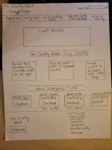
The wireframe I created for The Crafty Nest shows a warm, welcoming craft‑focused website designed to inspire creativity and make it easy for visitors to explore. The layout emphasizes clarity and simplicity: a clean header with navigation, a strong hero image with a tagline, and featured beginner‑friendly tutorials such as water coloring, rock painting, and DIY crafts. My goal is to create a visually organized space where users can quickly find craft ideas by category—DIY projects, kid crafts, paper crafts, sewing, beadwork, and more. I would like to change the feeling of my website to a more inviting and creative community.
I also want the site to function like a well‑structured craft magazine, with clear hierarchy, consistent image‑plus‑text blocks, and intuitive pathways to explore new content. I would like to include a subscribe button/section to grow an engaged audience. My end goal is for “The Crafty Nest” to be aesthetically pleasing, easy to navigate, and supportive of beginners and hobbyists looking for inspiration.
Planned Improvements
- Increase white space between blog posts to improve readability and reduce visual clutter.
- Add consistent category cards with icons or images to help users quickly identify craft types.
- Improve header hierarchy by enlarging the logo and simplifying the top navigation for easier scanning.
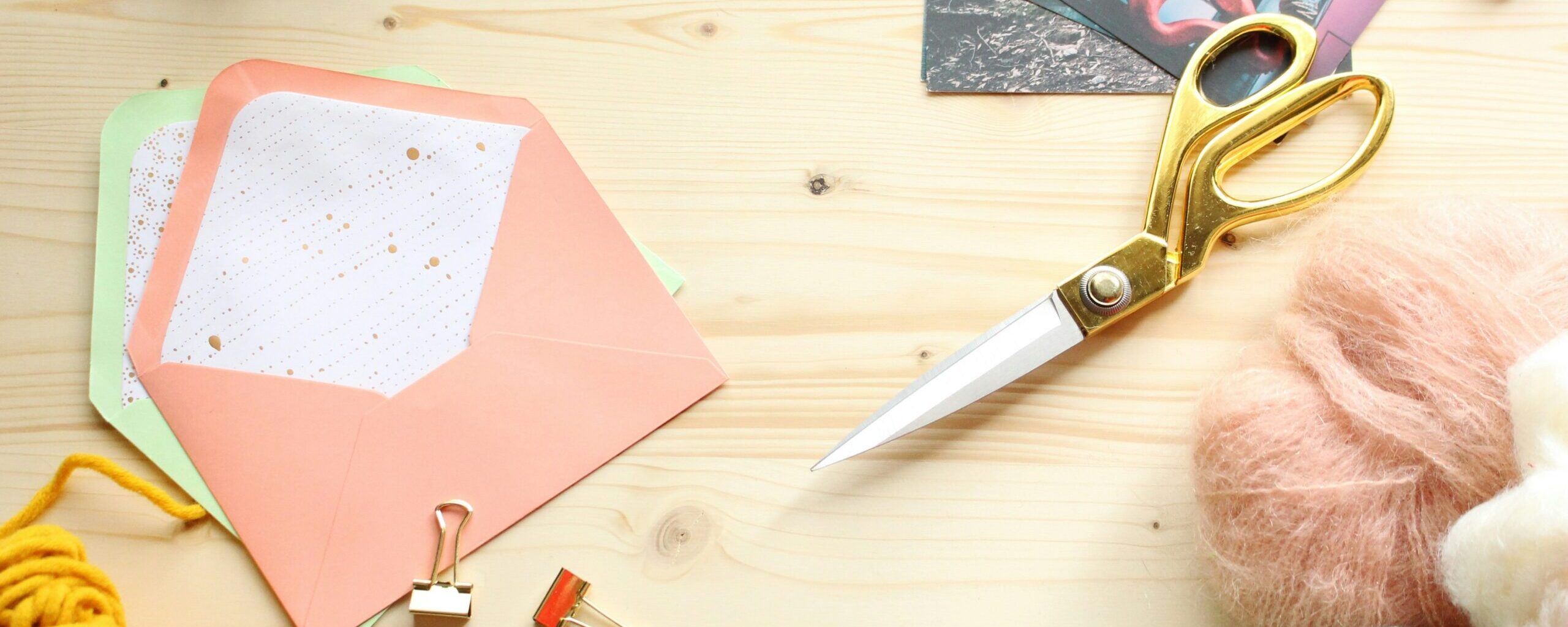
- Enhance the hero section with a higher‑quality banner image and a clearer tagline to strengthen first impressions.